

Ivana & Katerina
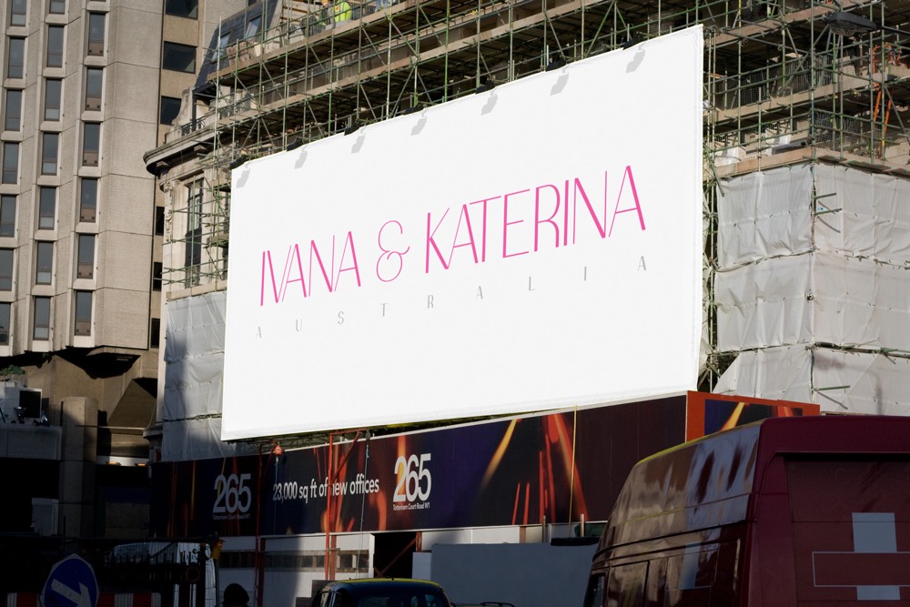
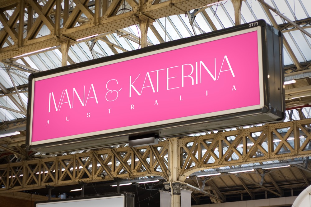
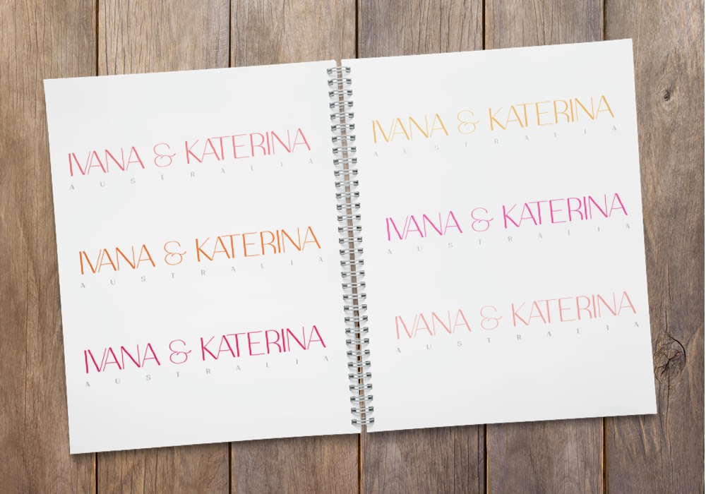
The aim for this iteration of the logo was to make it much more elegant than the previous version. Ostrich Sans turned out to be the perfect choice for this. Hot pink remained as the primary colour, although variations using orange and yellow also worked really well.
